India,
repositioning metvy
repositioning metvy
background
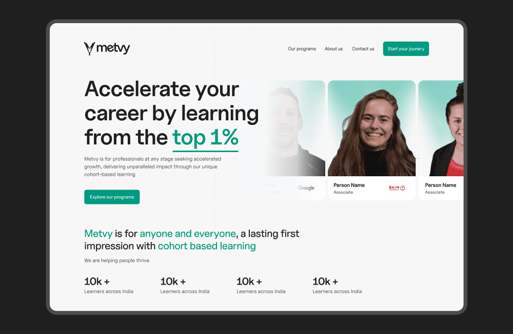
metvy had a product people believed in, mentors from google, apple, bain, a growing community, real programs.
but the website wasn't reflecting any of that.
users were landing and leaving before they understood what metvy actually was.
metvy had a product people believed in, mentors from google, apple, bain, a growing community, real programs.
but the website wasn't reflecting any of that.
users were landing and leaving before they understood what metvy actually was.
challenge
how do you reposition a brand that's already running,
without losing what's working, while making the product feel as strong as the community behind it?
how do you reposition a brand that's already running,
without losing what's working, while making the product feel as strong as the community behind it?
my role
led everything end to end, brand direction, website redesign, landing page experiments, and two new verticals from scratch. worked directly with founders, led a team of 2 designers throughout.
led everything end to end, brand direction, website redesign, landing page experiments, and two new verticals from scratch. worked directly with founders, led a team of 2 designers throughout.
outcomes
brand repositioned with a clearer market identity
website rebuilt end to end with a conversion-focused user journey
ad roas turned positive after landing page experiments
2 new product verticals launched under the metvy brand
the full story
the full story
metvy is a cohort-based learning platform. 500+ mentors, 200+ brands, programs running across india and beyond.
the product was real. the community was growing.
but when you landed on the website, none of that came through.
metvy is a cohort-based learning platform. 500+ mentors, 200+ brands, programs running across india and beyond.
the product was real. the community was growing.
but when you landed on the website, none of that came through.
where things were breaking
where things were breaking
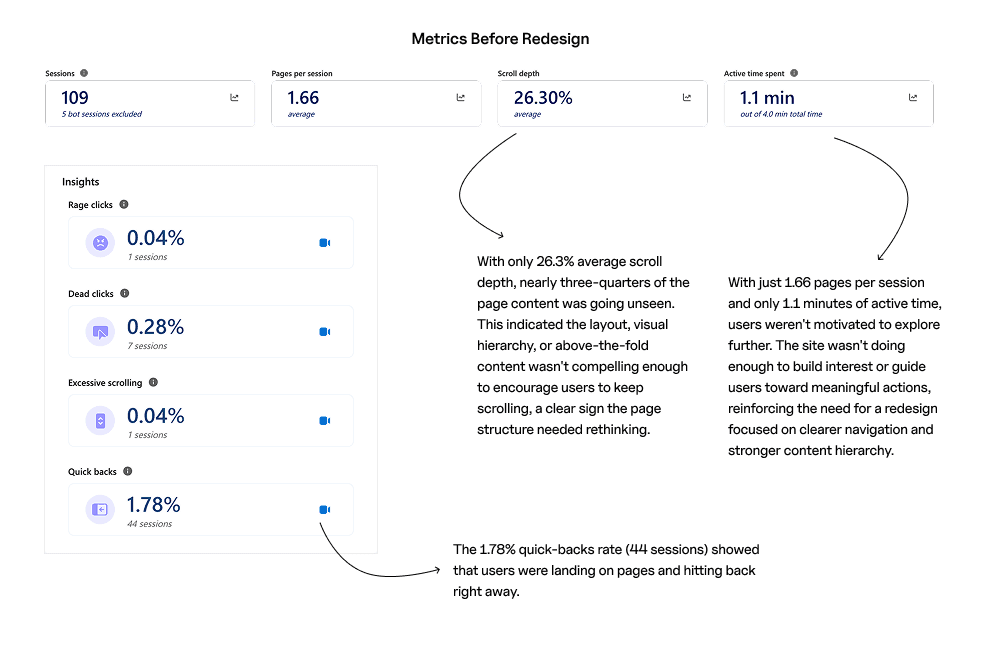
1. trust wasn't building fast enough
users weren't seeing the quality of mentors or programs early enough. by the time the good stuff appeared, most had already left.
2. ads were spending but not converting
people were clicking. but the landing pages weren't matching what the ad promised.
3. the brand didn't have a clear identity
metvy was doing a lot of things. but the website was trying to say all of them at once. which meant nothing was landing clearly.
1. trust wasn't building fast enough
users weren't seeing the quality of mentors or programs early enough. by the time the good stuff appeared, most had already left.
2. ads were spending but not converting
people were clicking. but the landing pages weren't matching what the ad promised.
3. the brand didn't have a clear identity
metvy was doing a lot of things. but the website was trying to say all of them at once. which meant nothing was landing clearly.
how i approached it
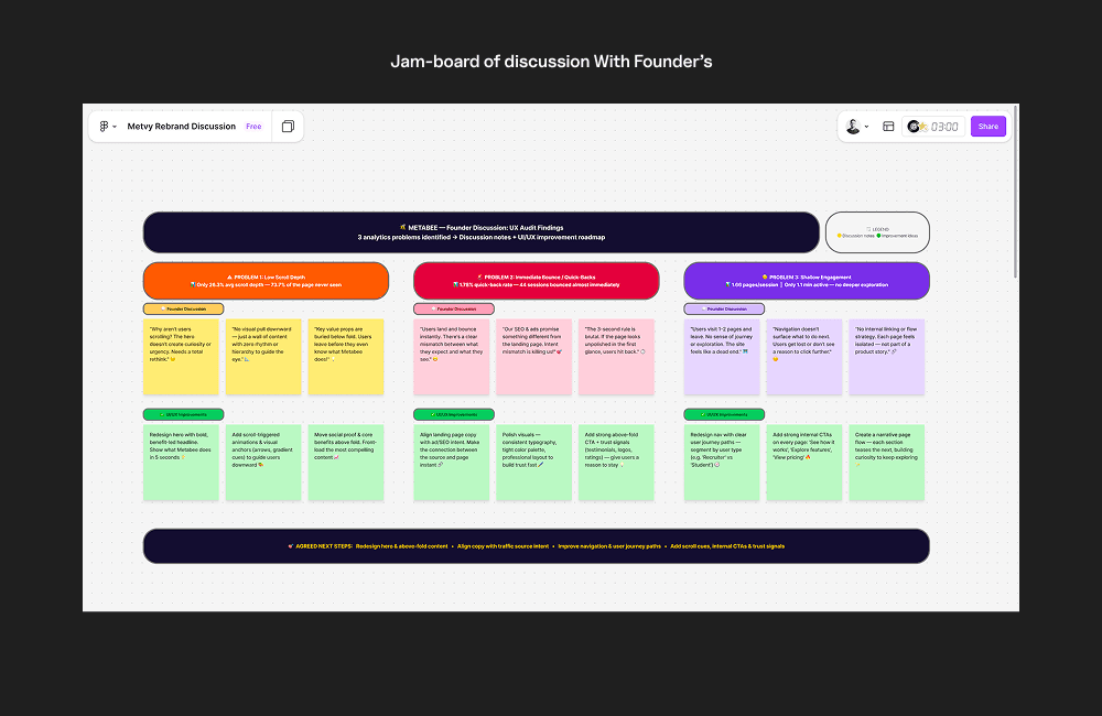
before touching figma, we sat with the founders and got the positioning right.
who is metvy for. what does it promise. why does it matter.
i ran a few working sessions with the founders, not design reviews,
just honest conversations about what metvy was and what it wasn't. that clarity was worth more than any wireframe.
before touching figma, we sat with the founders and got the positioning right.
who is metvy for. what does it promise. why does it matter.
i ran a few working sessions with the founders, not design reviews,
just honest conversations about what metvy was and what it wasn't. that clarity was worth more than any wireframe.
initial research
metvy wasn’t trying to build just another edtech platform,
it was focused on one specific thing:
delivering cohort-based learning experiences with top 1% mentors.
the promise was real, fast-track your career through tight, outcome-driven programs led by people who've actually done the work.
i dug into user feedback from active cohorts, spoke to learners, and studied the landscape.
platforms like:
GrowthX → great community energy, but invite-only and closed
Maven → strong on creator-led instruction, but not built for scaling in india
upGrad → enterprise-grade polish, but bloated UX and slow to adapt
what i noticed:
- learners wanted clarity before commitment
- they trusted mentors, not marketing
- they needed structure, not just a Slack group and a calendar
- they were comparing fast — one scroll too long, and they’d bounce
metvy had the ingredients:
a solid mentor lineup, proven cohorts, and energy on the ground.
my job was to help them show that value fast and make it feel like the real thing.
metvy wasn’t trying to build just another edtech platform,
it was focused on one specific thing:
delivering cohort-based learning experiences with top 1% mentors.
the promise was real, fast-track your career through tight, outcome-driven programs led by people who've actually done the work.
i dug into user feedback from active cohorts, spoke to learners, and studied the landscape.
platforms like:
GrowthX → great community energy, but invite-only and closed
Maven → strong on creator-led instruction, but not built for scaling in india
upGrad → enterprise-grade polish, but bloated UX and slow to adapt
what i noticed:
- learners wanted clarity before commitment
- they trusted mentors, not marketing
- they needed structure, not just a Slack group and a calendar
- they were comparing fast — one scroll too long, and they’d bounce
metvy had the ingredients:
a solid mentor lineup, proven cohorts, and energy on the ground.
my job was to help them show that value fast and make it feel like the real thing.
strategy & direction
the product had depth.
my focus was to surface that value faster — and help the team build scalable blocks as new cohorts launched.
we tackled:
homepage → first-scroll value clarity
conversion flows → CTA blocks, proof of credibility
program structure → clearer roadmap per cohort
mentor onboarding → make it easier to contribute
growth pages → structured, clean, and conversion-ready
the product had depth.
my focus was to surface that value faster — and help the team build scalable blocks as new cohorts launched.
we tackled:
homepage → first-scroll value clarity
conversion flows → CTA blocks, proof of credibility
program structure → clearer roadmap per cohort
mentor onboarding → make it easier to contribute
growth pages → structured, clean, and conversion-ready
what we did
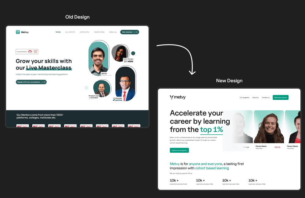
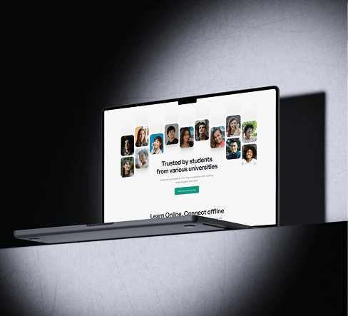
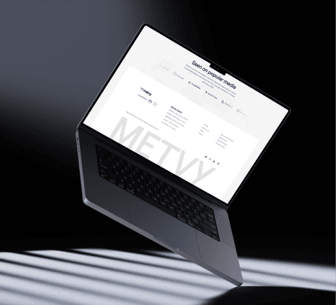
rebuilt the entire website around the new positioning.
every page got a clear job.
ran multiple landing page experiments tied directly to ad performance.
tested layouts, headlines, social proof placement, cta positioning.
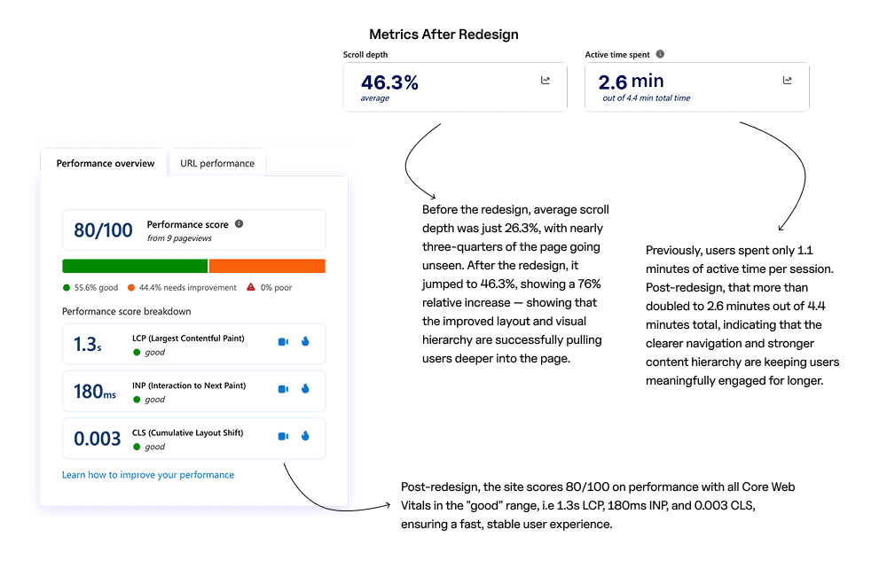
used microsoft clarity throughout, heatmaps, session recordings, scroll depth to make decisions based on data, not gut.
alongside the redesign, we built two new verticals under the metvy brand.
each needed its own positioning, page, and onboarding flow, built from scratch while everything else was still running.
rebuilt the entire website around the new positioning.
every page got a clear job.
ran multiple landing page experiments tied directly to ad performance.
tested layouts, headlines, social proof placement, cta positioning.
used microsoft clarity throughout, heatmaps, session recordings, scroll depth to make decisions based on data, not gut.
alongside the redesign, we built two new verticals under the metvy brand.
each needed its own positioning, page, and onboarding flow, built from scratch while everything else was still running.
the impact of work
+32%
increase in landing page conversions after experiments
+27%
improvement in ad roas over 3 rounds of iteration
+18%
increase in user engagement across the platform
~40%
reduction in drop-off on key program pages
key learnings
positioning is a product problem, not a marketing one. if the product doesn't know what it is, no amount of good design will fix it.
data over gut. clarity told us things no stakeholder meeting could. watch the sessions, then make the call.
running parallel workstreams is the real skill. a full redesign and two new products shipping at the same time — that's the job.
clarity before creativity. the best design decision we made wasn't a layout or a color. it was getting aligned on who metvy was for before we opened figma.